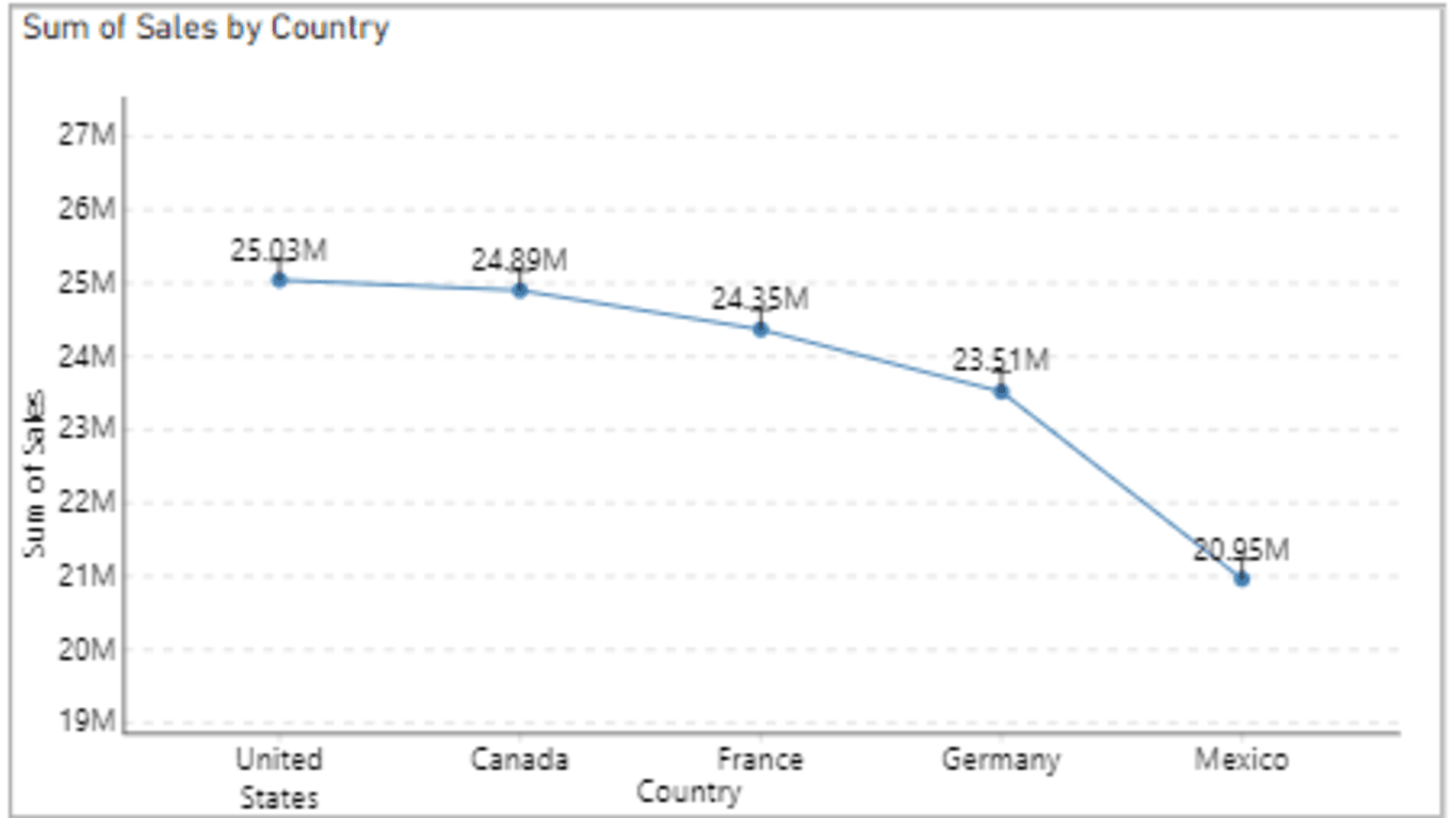
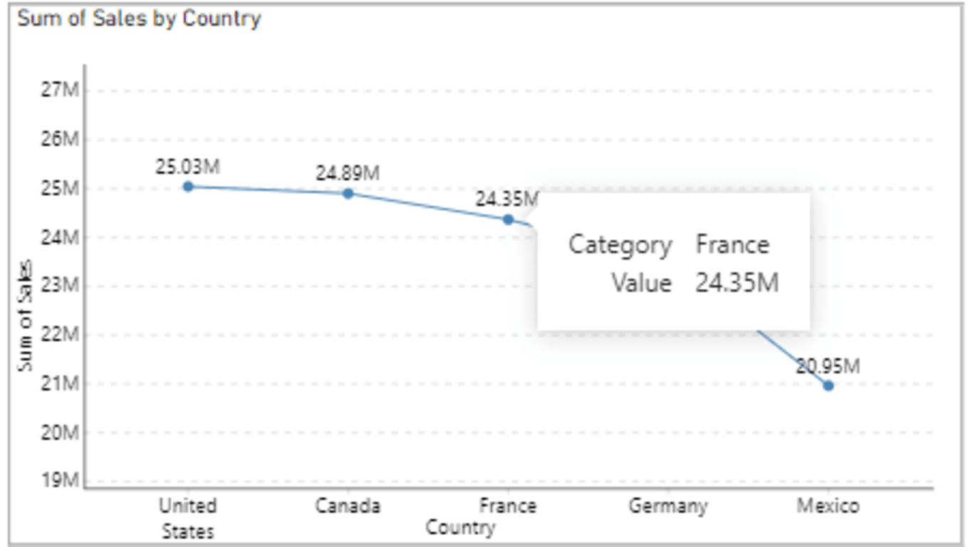
- Line Chart Visualization: The primary feature of the "Lined Insights" visual is the traditional line chart, which displays the trend of your data over time or any other continuous variable.
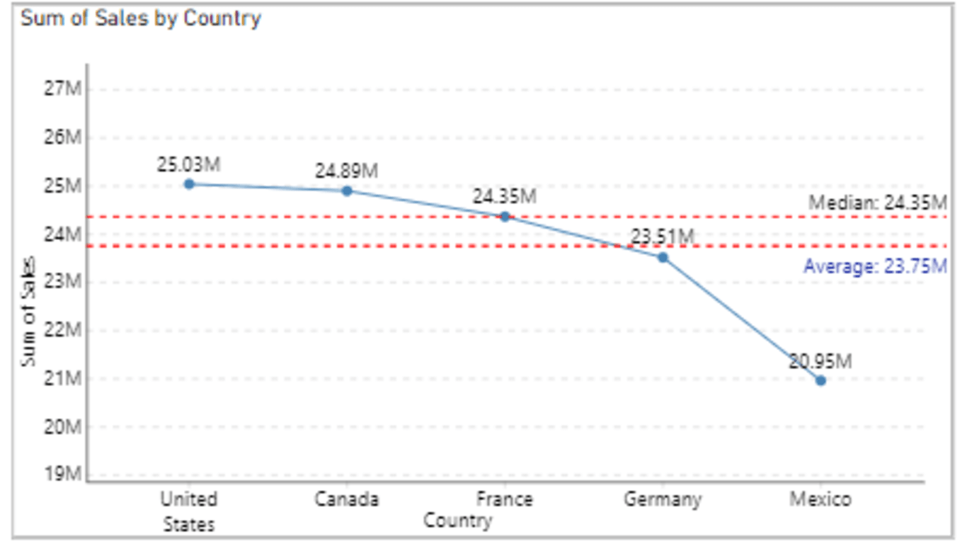
- Average Line: This feature adds a horizontal line on the chart representing the average value of the data series. It allows users to easily compare individual data points to the overall average trend.
- Median Line: Similar to the average line, the median line represents the median value of the data series. This provides an alternative measure of central tendency, particularly useful if the data contains outliers.
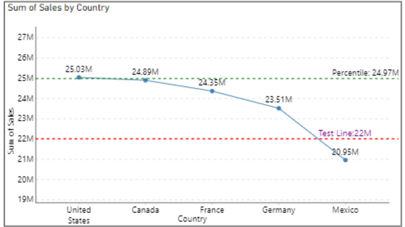
- Y-Axis Constant Line: Users can set a constant value for the Y-axis, which is represented as a horizontal line across the chart. This helps in visualising specific thresholds or targets that need to be maintained or achieved.
- Error Bars: Error bars provide a visual representation of the variability or uncertainty in the data. These bars extend from each data point, indicating the range within which the true value is expected to lie. This feature aids in understanding the reliability of the data points and the overall trend.
- Percentile Line: Users can choose to display a percentile line on the chart, representing a specific percentile of the data distribution (e.g., 25th percentile, 75th percentile). This is particularly useful for understanding the distribution of data points and identifying outliers or unusual patterns.
This custom visual is an invaluable asset for data analysts, providing flexibility
and interactivity while maintaining a user-friendly interface. It empowers users
to make data-driven decisions with ease and precision.